Unit-6 (Toasts)
Accessing the Unit-6
Clone the unit-6, branch to start this tutorial.
Intro
Ib this unit we will be covering toasts, but what the hell is a toast?
A toast... is a small message that shows up in a box at the bottom of the screen and disappears on its own after few seconds. It is a simple feedback about an operation in which current activity remains visible and interactive.
We will be using toasts in our app to inform the user an operation has been preformed, for example the user add a movie to their favorites a success toast will then been shown.
The Toast component
The <Toast />(molecule) component has been provided to us. Its prop types are as follows:
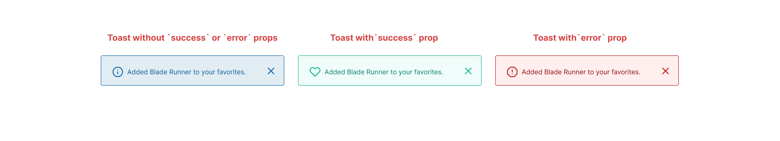
classNameis a string and allows us to add custom styleserroris a bool and allows us to change the Toast style and icon to display as an error Toastsuccessis a bool and allows us to change the Toast style and icon to display as an susses Toastmessageis a string and allows use to display a message in the Toast e.g "Added Blade Runner to your favorites."showis bool and allows us to animate the Toast into the view porthideis bool and allows us to animate the Toast out of the view port
This is what the error and success props look like when added to the component.
And the code for the component looks like this. Note that the handleClick has a "TODO" comment next to it, don't worry about this for now we will be handling it in the task.
import React from 'react';
import PropTypes from 'prop-types';
import {
  FiInfo, FiCheck, FiX, FiAlertOctagon,
} from 'react-icons/fi';
import styles from './toast.module.scss';

const Toast = ({
  className,
  error,
  success,
  message,
  show,
  hide,
}) => {
  // TODO:
  const handleClick = () => {
    console.log('toast was closed');
  };

  const showOrHideToast = () => {
    if (show) return `${styles['toast--show']}`;
    if (hide) return `${styles['toast--hide']}`;

    return '';
  };

  if (error) {
    return (
      <div className={`${className} ${styles.toast} ${styles['toast--error']} ${showOrHideToast()}`}>
        <div className={styles.toast__container}>
          <FiAlertOctagon className={styles.toast__icon} />
          <p className={styles.toast__para}>{message}</p>
          <button
            type="button"
            className={styles.toast__button}
            onClick={handleClick}
          >
            <FiX className={styles.toast__icon} />
          </button>
        </div>
      </div>
    );
  }

  if (success) {
    return (
      <div className={`${className} ${styles.toast} ${styles['toast--success']} ${showOrHideToast()}`}>
        <div className={styles.toast__container}>
          <FiCheck className={styles.toast__icon} />
          <p className={styles.toast__para}>{message}</p>
          <button
            type="button"
            className={styles.toast__button}
            onClick={handleClick}
          >
            <FiX className={styles.toast__icon} />
          </button>
        </div>
      </div>
    );
  }

  return (
    <div className={`${className} ${styles.toast} ${showOrHideToast()}`}>
      <div className={styles.toast__container}>
        <FiInfo className={styles.toast__icon} />
        <p className={styles.toast__para}>{message}</p>
        <button
          type="button"
          className={styles.toast__button}
          onClick={handleClick}
        >
          <FiX className={styles.toast__icon} />
        </button>
      </div>
    </div>
  );
};

Toast.propTypes = {
  className: PropTypes.string,
  error: PropTypes.bool,
  success: PropTypes.bool,
  show: PropTypes.bool,
  hide: PropTypes.bool,
  message: PropTypes.string,
};

Toast.defaultProps = {
  className: '',
  error: false,
  success: false,
  show: false,
  hide: false,
  message: 'Add a toast massage as a prop',
};

export default Toast;
Adding our Toast to our Layout component
As our <Toast /> component can be used anywhere in the app we don't want to add it to individual page components but instead have it as part of our <Layout /> component and update it using our global state. But first lets add it to our <Layout /> component and lets also hard code the props just so we can see what the component looks like.
return (
    <div className={styles.layout}>
      <Header
        className={styles.layout__header}
        showMobileNav={showMobileNav}
        setShowMobileNav={setShowMobileNav}
      />
      <Search className={styles.layout__search} />
      <Nav className={styles.layout__nav} showMobileNav={showMobileNav} />
      <main className={styles.layout__main}>
        <div className={styles.layout__wrapper}>
          {children}
        </div>
      </main>
      {/* Added Toast component */}
      <Toast
        show
        message="Test toast"
        success
      />
    </div>
  );
Toast actions and reducer
Next we need to set up the actions that will show or hide our toast showToast and hideToast in actions/toastActions.js
import { createAction } from '@reduxjs/toolkit';

export const showToast = createAction('SHOW_TOAST');
export const hideToast = createAction('HIDE_TOAST');
After this we need to set up our toastReducer in reducers/toastReducer.js. We first need to set up our initialState then add the showToast to the builder. This will update our state to show our toast. And we also need to add our hideToast to the builder that will update the state to hide our toast.
import { createReducer } from '@reduxjs/toolkit';
import { showToast, hideToast } from '../actions/toastActions';

const initialState = {
  toast: {
    display: false,
    message: '',
    type: 'default',
  },
};

const toastReducer = createReducer(initialState, (builder) => {
  builder
    .addCase(showToast, (state, action) => {
      state.toast = { ...action.payload, display: true };
    })
    .addCase(hideToast, (state, action) => {
      state.toast = { ...action.payload, display: false };
    });
});

export default toastReducer;
Lastly we need to add our new reducer to our store in store.js.
import { configureStore } from '@reduxjs/toolkit';
import favoritesReducer from './reducers/favoritesReducer';
import moviesReducer from './reducers/moviesReducer';
import toastReducer from './reducers/toastReducer';

export const store = configureStore({
  reducer: {
    favorites: favoritesReducer,
    movies: moviesReducer,
    toast: toastReducer,
  },
});
Showing our Toast component depending on our toast store
Now we have our toastStore we need to get our <Toast /> component to use it. In the Layout component we need to add some new state called toastState.
const [toastState, setToastState] = useState('');
Then we need to get our toast store using useSelectorand we also need to add a useEffect hook to listen out for a change in our toast store. If there is a change in our toast store the useEffect hook will fire the setToastState updating the toastState state.
const toastStore = useSelector((state) => state.toast);
useEffect(() => {
  setToastState(toastStore.toast);
}, [toastStore]);
Lastly, we need to update our <Toast /> component to use our toastState.
<Toast
  show={toastState.display}
  hide={toastState.display}
  message={toastState.message}
  error={toastState.type === 'error'}
  success={toastState.type === 'success'}
/>
This is what our finished component should look like.
import React, { useState, useEffect } from 'react';
import PropTypes from 'prop-types';
import { useSelector } from 'react-redux';
import styles from './layout.module.scss';
import Header from '../../organisms/header/header';
import Search from '../../organisms/search/search';
import Nav from '../../organisms/nav/nav';
import Toast from '../../molecules/toast/toast';

const Layout = ({ children }) => {
  const [showMobileNav, setShowMobileNav] = useState(false);
  const [toastState, setToastState] = useState('');

  const toastStore = useSelector((state) => state.toast);
  useEffect(() => {
    setToastState(toastStore.toast);
  }, [toastStore]);

  return (
    <div className={styles.layout}>
      <Header
        className={styles.layout__header}
        showMobileNav={showMobileNav}
        setShowMobileNav={setShowMobileNav}
      />
      <Search className={styles.layout__search} />
      <Nav className={styles.layout__nav} showMobileNav={showMobileNav} />
      <main className={styles.layout__main}>
        <div className={styles.layout__wrapper}>
          {children}
        </div>
      </main>
      <Toast
        show={toastState.display}
        hide={toastState.display}
        message={toastState.message}
        error={toastState.type === 'error'}
        success={toastState.type === 'success'}
      />
    </div>
  );
};

Layout.propTypes = {
  children: PropTypes.node.isRequired,
};

export default Layout;
Showing our Toast when a favorite is added
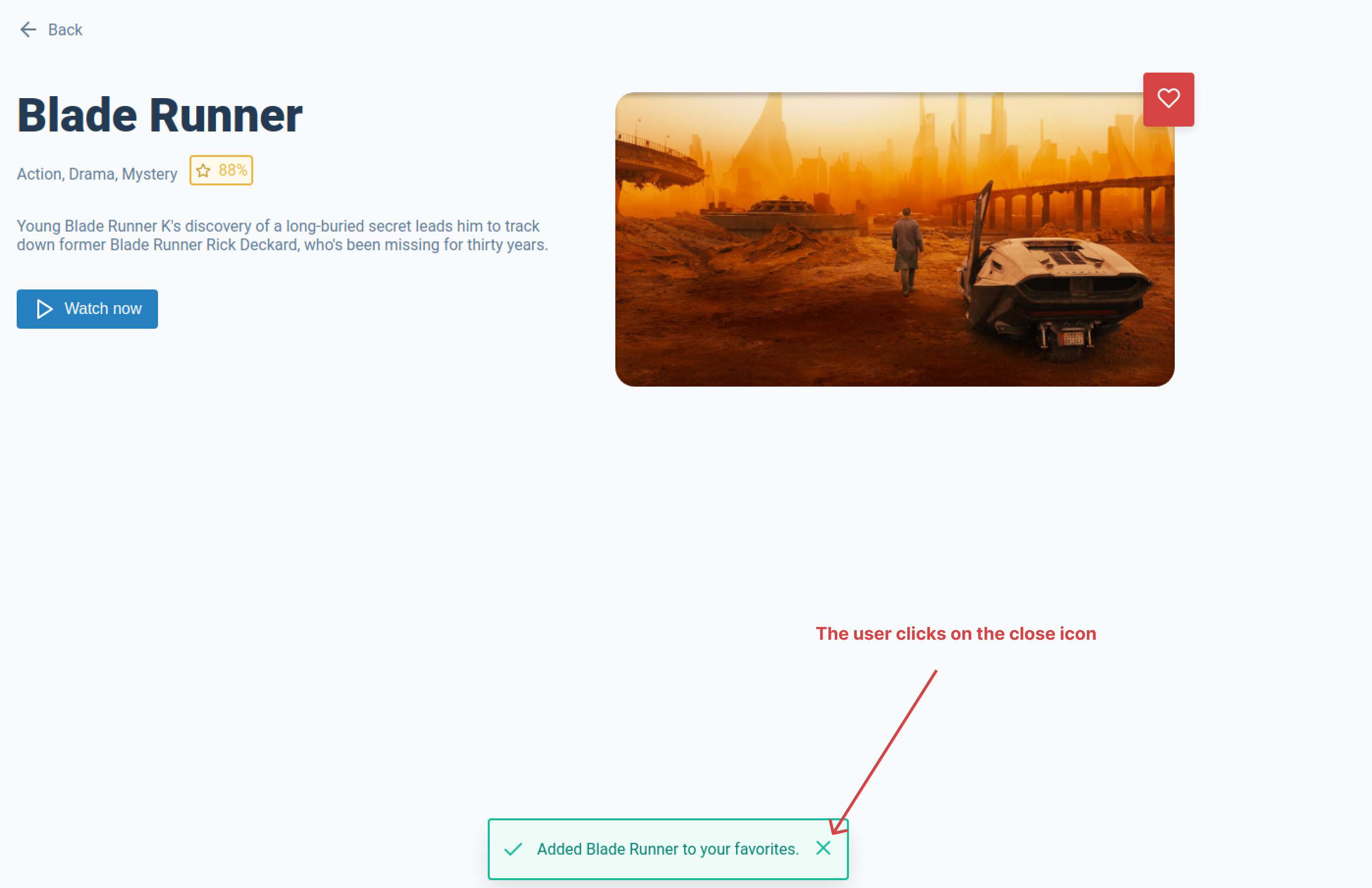
The last thing we need to do is add our SHOW_TOAST dispatch to our handleAddToFavorites function in the <MoveSection /> component. The payload for our new dispatch will need to set display true, the message we want to show with the movie title and the type will need to be set to success. Now when the user clicks on the add to favorites button a success toast will be shown
const handleAddToFavorites = () => {
  if (!movieIsInFavorites) {
    dispatch({ type: 'ADD_TO_FAVORITES', payload: movieObj });

    // Show success toast
    dispatch({
      type: 'SHOW_TOAST',
      payload: {
        display: true,
        message: `Added ${Title} to your favorites. `,
        type: 'success',
      },
    });
  }
};
Task
Task 1
Now you may have noticed that when the toast is shown there is no way of closing it, you will need to update the handleClick inside of the <Toast /> component to fire a dispatch to close the toast when the close icon is clicked.
Task 2
It would also be good to hide the toast after 2 sections. You will need to add another useEffect in the <Layout /> component to hide the toast if display: true is set in the the toast store.
caution
You will need to use a setTimeout function in your useEffect hook. However, you will need to clear the setTimeout in your useEffect otherwise this may lead to performance issues. See this article by Felix Gerschau.
If you get stuck or get overwhelmed remember you can always get the answers for these tasks on the unit-6-answers page.