Unit-2 (an intro into useEffect)
Accessing the Unit-2 tutorial
Clone the unit-2, branch to start this tutorial.
useEffect
In this unit we will start looking at the useEffect hook in React,
The Effect Hook lets you perform side effects in function components. Data fetching, setting up a subscription, and manually changing the DOM in React components are all examples of side effects.
Side effects are basically anything that affects something outside of the scope of the current function that’s being executed.
Lets use the useEffect hook
The useEffect() hook accepts 2 arguments:
useEffect(callback[, dependencies]);
- callback is the function containing the side-effect logic. callback is executed right after changes were being pushed to DOM.
- dependencies is an optional array of dependencies. useEffect() executes callback only if the dependencies have changed between renderings.
Lets start by just using the callback function in useEffect. This example will update the document title to
"The checkbox is checked" or to "The checkbox is unchecked" every time the component is updated, remember when we update
our state (setChecked) the component will update/re-render. When it does do that our callback function in our useEffect
hook will update the document title.
import React, { useState, useEffect } from 'react';

function Example() {
  const [checked, setChecked] = useState(false);

  useEffect(() => {
    document.title = `The checkbox is ${checked ? 'checked' : 'unchecked'}`;
  });

  return (
    <div>
      <label>
        <input
        type="checkbox"
        checked={checked}
         onChange={() => {setChecked(!checked)}}
        />
        <span>Check the checkbox</span>
        </label>
    </div>
  );
}
Now lets say we wanted to only update the document title when our checkbox is updated, but now we have some other
state in our component (setCount) that will update our component as well. So we now only want to update the document title
if checked is updated not when count is updated. We can do this by passing in checked into are array of dependencies in our use effect,
now when checked is updated the document title will now be changed to "The checkbox is checked" or "The checkbox is unchecked".
  useEffect(() => {
    document.title = `The checkbox is ${checked ? 'checked' : 'unchecked'}`;
  },[checked]);
import React, { useState, useEffect } from 'react';

function Example() {
  const [checked, setChecked] = useState(false);
  const [count, setCount] = useState(0);

  useEffect(() => {
    document.title = `The checkbox is ${checked ? 'checked' : 'unchecked'}`;
  },[checked]);

  return (
    <div>
      <label>
        <input
        type="checkbox"
        checked={checked}
         onChange={() => {setChecked(!checked)}}
        />
        <span>Check the checkbox</span>
        </label>
       <button onClick={() => setCount(count + 1)}>
          Click me
        </button>
    </div>
  );
}
Task
In this weeks task we will be using useEffect in a bit of an abstract way. However, don't worry if you
don't fully understand the useEffect hook after this tutorial we will be going over it again in the future.
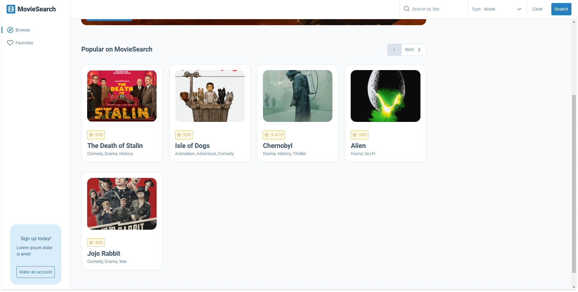
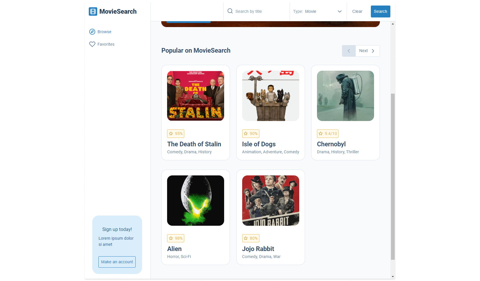
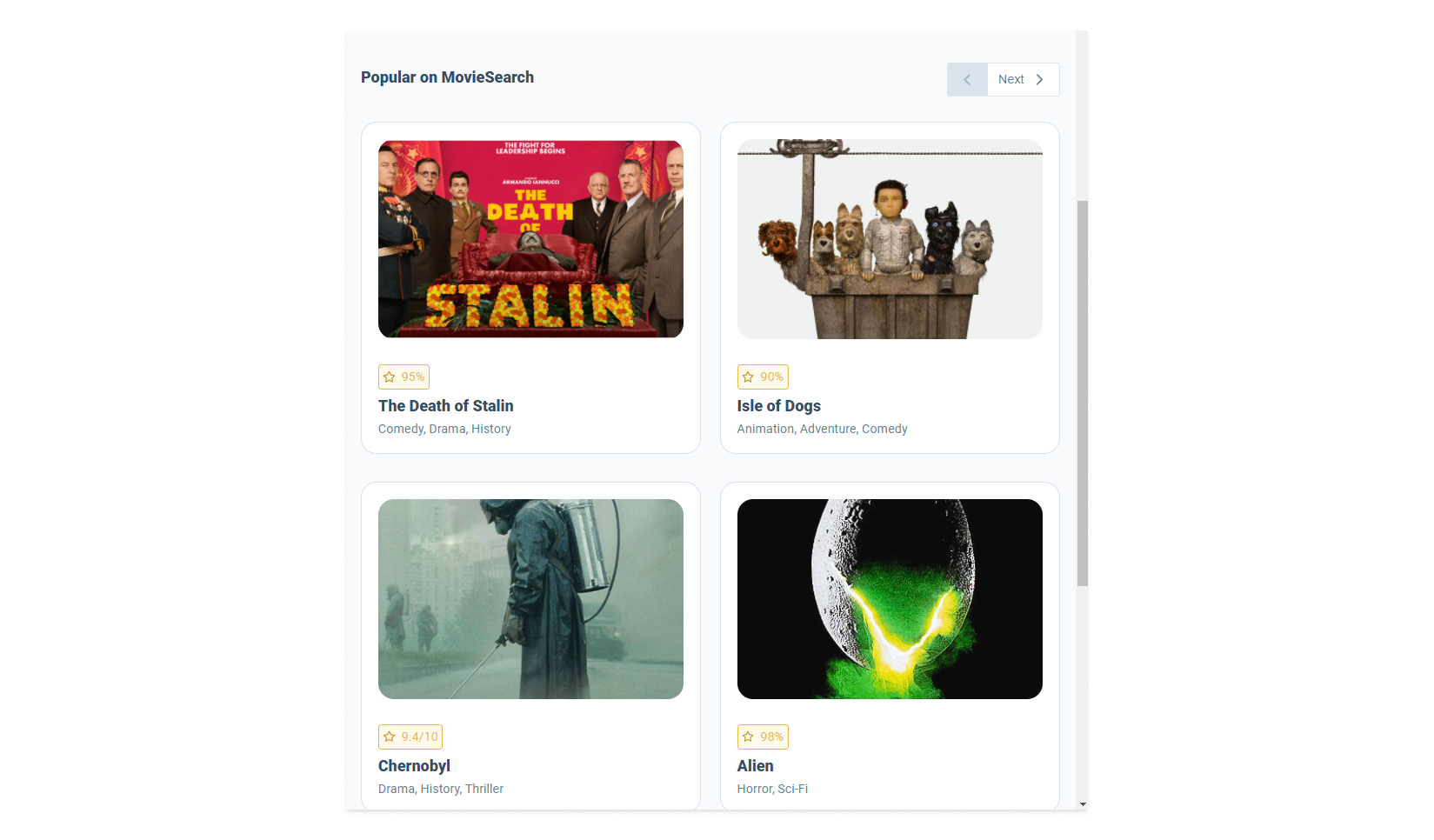
Let start by looking at the app, this week we are going to be working on the home page pagination.
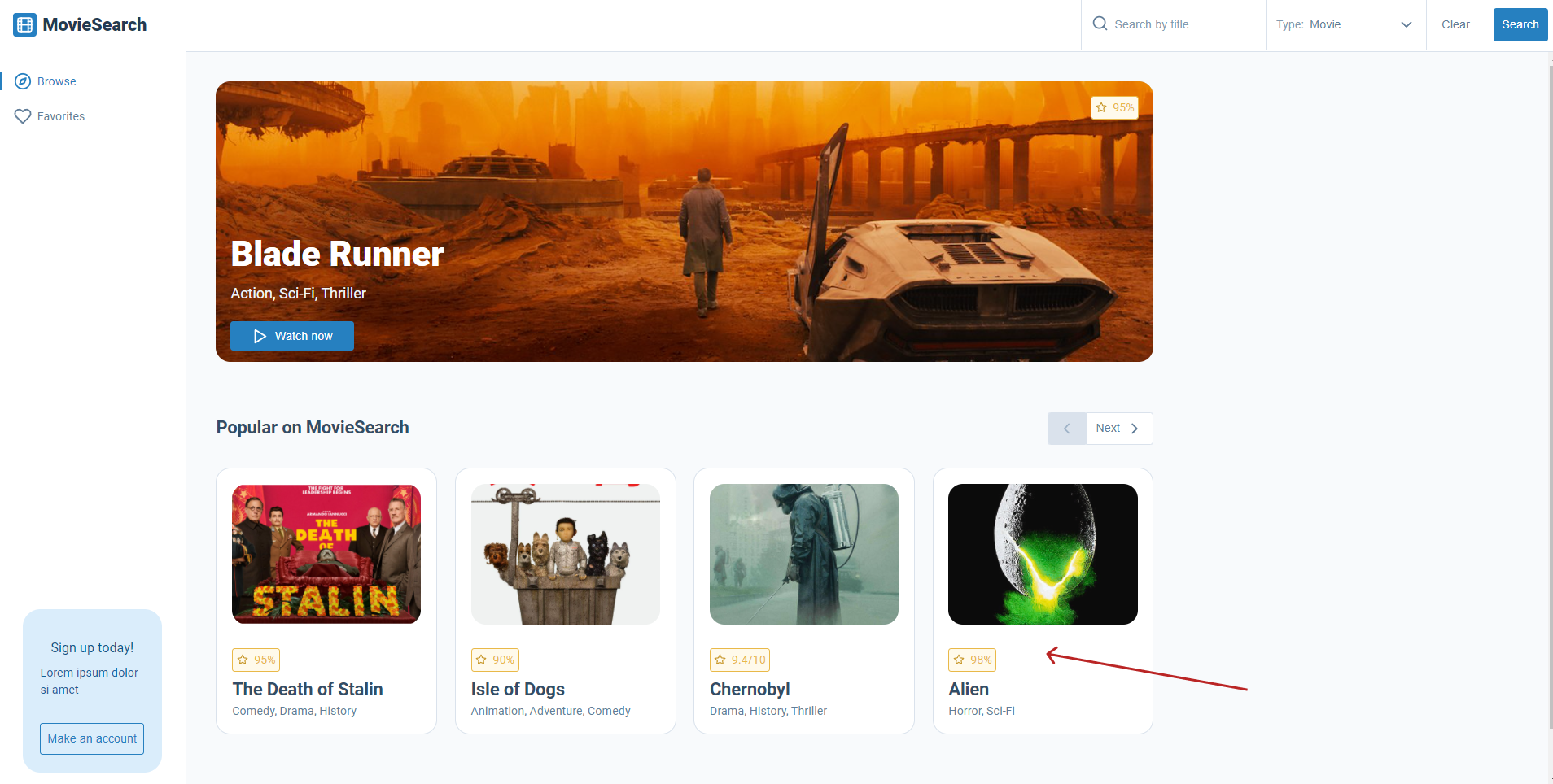
Navigate to popular-section.jsx in your code. The code should be as follows:
const PopularSection = ({ className, movies }) => {
// This will give us the width of the viewport every time the window size changes
const { width } = useWindowDimensions();
console.log(width);
return (
<section className={`${styles['popular-section']} ${className}`}>
<div className={styles['popular-section__title']}>
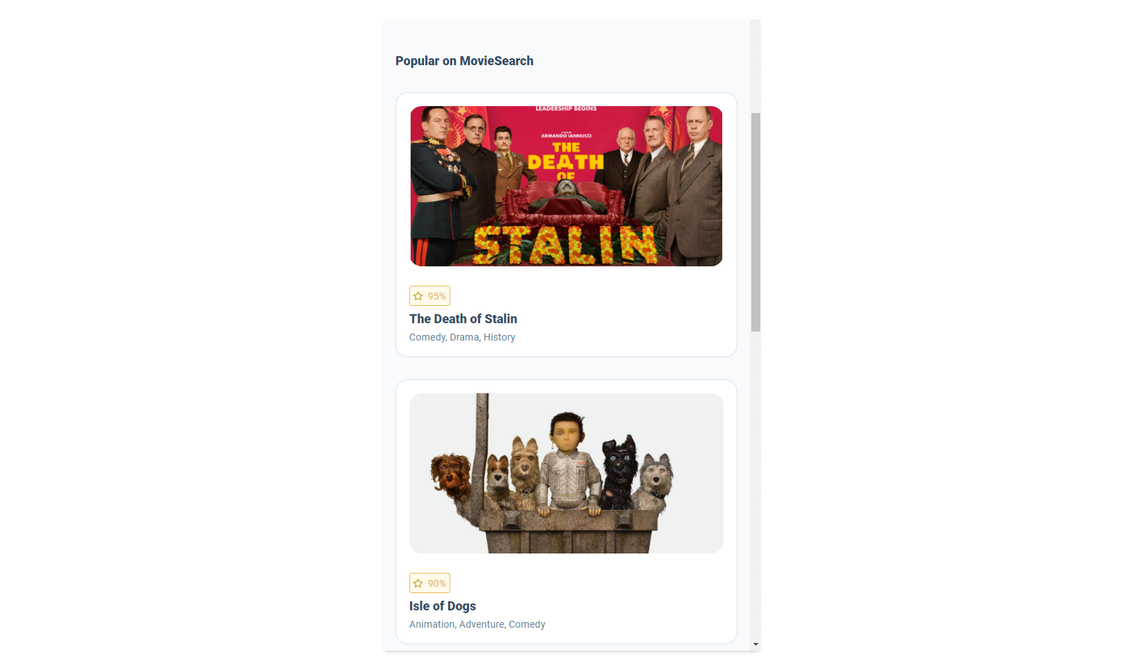
<SecondaryHeading className={styles['popular-section__secondary-heading']}>Popular on MovieSearch</SecondaryHeading>
<div className={styles['popular-section__pagination-buttons']}>
<PaginationButtons
next={() => console.log('next was clicked')}
previous={() => console.log('previous was clicked')}
disableLeft
disableRight={false}
/>
</div>
</div>
<div className={styles['popular-section__cards']}>
<Card movie={movies.popular[0]} />
<Card movie={movies.popular[1]} />
<Card movie={movies.popular[2]} />
<Card movie={movies.popular[3]} />
</div>
</section>
);
};
PopularSection.propTypes = {
className: PropTypes.string,
movies: PropTypes.arrayOf.isRequired,
};
PopularSection.defaultProps = {
className: '',
};
export default PopularSection;
For now don't worry about useWindowDimensions() it is a custom hook that allows us
to find out the width and height over the view port if it changes. However, our main
problem is that this code renders only four of our movie cards. If we had 10, 20, or 50 of them
this wouldn't be a good way of rendering our movies cards.
<div className={styles['popular-section__cards']}>
  <Card movie={movies.popular[0]} />
  <Card movie={movies.popular[1]} />
  <Card movie={movies.popular[2]} />
  <Card movie={movies.popular[3]} />
</div>
Lets change this code to dynamically render our movie cards, to this we will need to use the map method. However, in React when we transform arrays into lists of elements we need to add a key to each item.
Keys help React identify which items have changed, are added, or are removed. Keys should be given to the elements inside the array to give the elements a stable identity:
In our chase the movies.popular array is an array of objects and each object has an imdbID ID that is unique so lets use that.
Our code should look something like this:
<div className={styles['popular-section__cards']}>
  {paginatedMovies.map((movie) => (
    <Card movie={movie} key={movie.imdbID} />
  ))}
</div>
Now we have new problem, if there is not enough space on the screen the cards will stack, even on different screen sizes.
In our design we don't want this to happen but instead we want our cards to be displayed
in one row and the amount of card displayed will change depending on the screen size.
Note CSS will handle our columns for us but we will need to stop the cards from stacking,
for that we will need to get React to do this for us. Luckily we have the useWindowDimensions()
custom hook that will allow us to get the view port size every time the user updates it.
Task
Your task is to build the pagination for the <PopularSection /> component, you will need to
show the following cards on these screen sizes:
- 1280px > 4 cards
- 1040px > 3 cards
- 768px > 2 cards
- under 768px we don't want to have any pagination
Lastly, the <PaginationButtons> component will allow the user to load more cards
onto the page.

The props next and previous both except functions, this allows you to update
your pagination when the user clicks on one of the buttons. If the the disableLeft
or the disableRight prop is true this will hide the button text and disable the
button so the user can't click on it.
<PaginationButtons
  next={() => console.log('next was clicked')}
  previous={() => console.log('previous was clicked')}
  disableLeft
  disableRight={false}
/>
If you get stuck or get overwhelmed remember you can always get the answer for this task on the unit-2-answers page.