Getting started
A quick note about the course
In this course we will be making a small application that fetches data from the omdbapi API, then show this data to the user and allow the user to save films to their favourites.
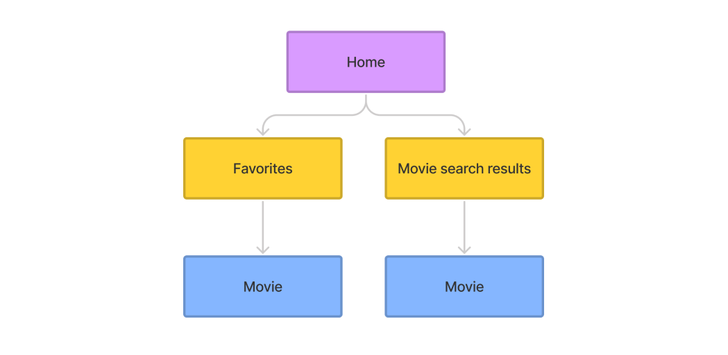
The site map is as follows:
This course expects you to have a small amount of prior knowledge on react, mainly concepts such as prop-drilling and how functional components work. We will mainly be covering more advanced topics such as Redux , React Router v6 and fetching data from the omdbapi API. This course also does not cover styling as is mainly focused on React, however how the styling works is documented further down on this page.
Accessing the design files
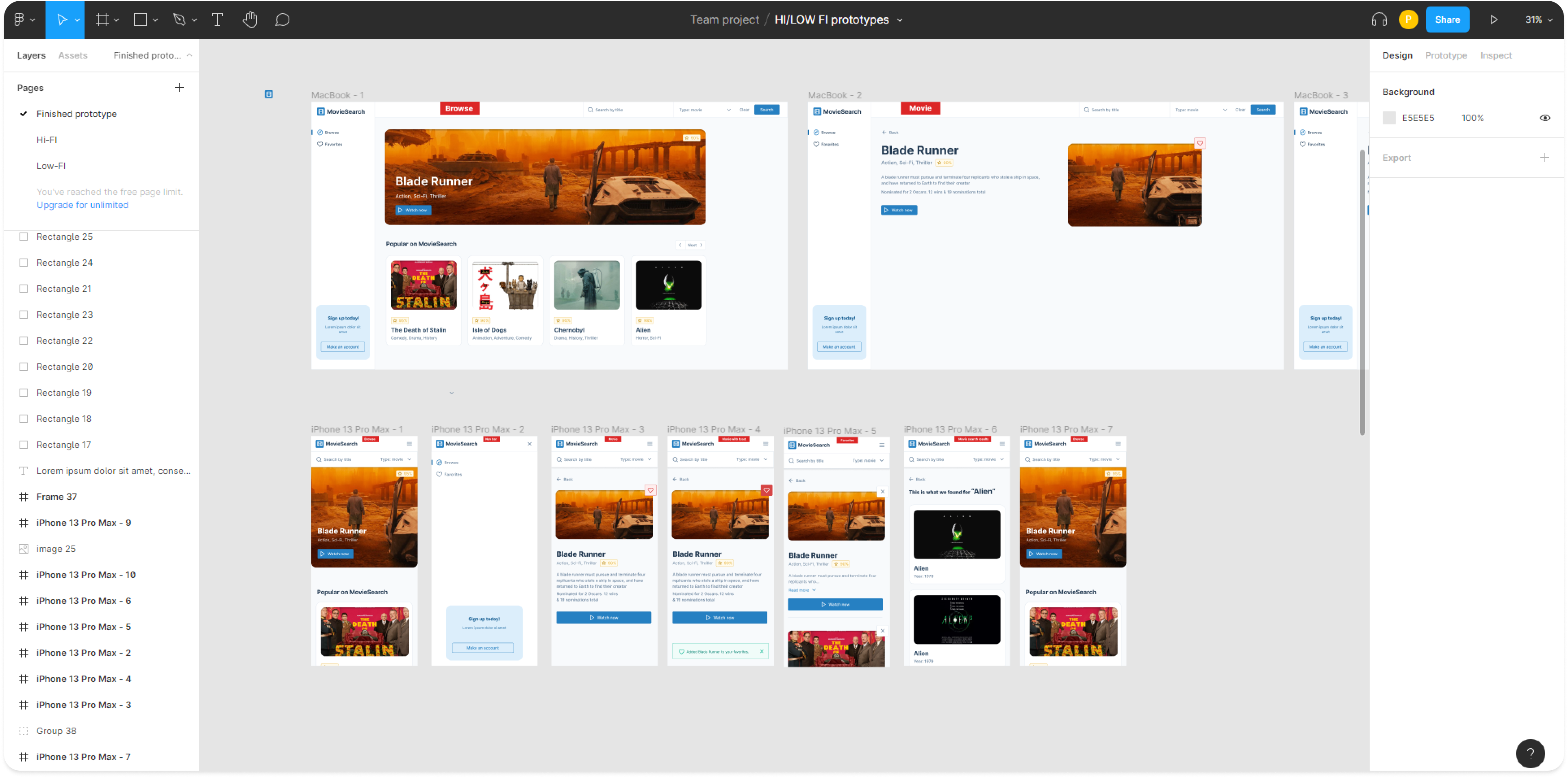
You can find the design for the project in the /design files folder, these contain the high/low fidelity prototypes for the application in PDF and in .fig format. The .fig format is a file format used by Figma a design and prototyping tool
Accessing each lesson/unit
The project is split up into multiple lessons called units, if you just want to get a feel for the project clone the master branch, this is what the project looks like after you finish every unit. If you want to dive right in, clone the unit-1 branch. Each unit branch is accompanied by an answers branch (e.g. unit-1, unit-1-answers) so, if you get stuck you can always compare your work to the answers branch.
Configuring ESlint
Firstly, we strongly recommend using Visual Studio Code as your code editor for this project. This will make setting up ESlint a lot easier.
ESLint is a tool for identifying and reporting on patterns found in ECMAScript/JavaScript code, with the goal of making code more consistent and avoiding bugs.– eslint.org
You will need to install the ESlint plugin for VScode, add the following code to your settings.json in VScode:
}
    "eslint.validate": [
      "javascript",
      "javascriptreact",
    ],
    "eslint.alwaysShowStatus": true,
    "eslint.format.enable": true,
    "editor.codeActionsOnSave": {
        "source.fixAll.eslint": true
    },
    "editor.defaultFormatter": "dbaeumer.vscode-eslint",
    "editor.formatOnSave": true,
    "workbench.startupEditor": "none"
}
Start your first unit
After you have cloned unit-1, you will need to run the following commands to install all of your dependencies and run the project.
info
If you haven’t already got Node you will need to download it as we will need it to download all of the project dependencies, see link.
npm install
npm start
After running npm start will, you project will start on http://localhost:3000.
Component structure
This project uses atomic design by Brad Frost for its component structure, atomic design is methodology for creating design systems. There are five distinct levels in atomic design:
- Atoms
- Molecules
- Organisms
- Templates
- Pages
atoms
Atoms are the basic building blocks of matter. Applied to web interfaces, atoms are our HTML tags, such as a form label, an input or a button.
For example the ButtonPrimary component:

molecules
Molecules are groups of atoms bonded together and are the smallest fundamental units of a compound. These molecules take on their own properties and serve as the backbone of our design systems.
For example the InputWithLabel component:

organisms
Organisms are groups of molecules joined together to form a relatively complex, distinct section of an interface.
For example the Search component:

templates
Templates consist mostly of groups of organisms stitched together to form pages.
For example the Layout component:
pages
Pages are specific instances of templates.
For example the Home page:
Styling
For styling this project uses SCSS modules, this allows us to directly import styles into each one of our react components and it localises the styles to that component. What this in essence means is that styles from one component cannot override the styles from another component. This is useful as if we decide to remove a style from a component it does not affect anything else in the app. As we are using SCSS we can take advantage of the BEM naming convention and that’s also why you may see class names such as styles['nav__link--active'].
caution
Writing BEM class names as styles['nav__link--active'] in the JSX may be updated in future, as this is a slightly messy way of implementing BEM into JSX, especially when implementing template literals for example:
`${styles.nav} ${showMobileNav ? styles['nav--show'] : styles['nav--hide']}`.
Compared to BEM without the use of SCSS modules
`nav ${showMobileNav ?'nav--show' : 'nav--hide'}`.
See David Barral’s article on how he implemented BEM with CSS modules.
The example below shows how SCSS modules are implanted, note that the styles are imported into the React component.
import React from 'react';
import PropTypes from 'prop-types';
import { FiCompass, FiHeart } from 'react-icons/fi';
import styles from './nav.module.scss';
import CallToAction from '../../molecules/call-to-action/call-to-action';

const Nav = ({ className, showMobileNav }) => (
  <nav className={`${styles.nav} ${className} ${showMobileNav ? styles['nav--show'] : styles['nav--hide']}`}>
    <ul className={styles.nav__list}>
      <li className={styles.nav__item}>
        <a className={styles['nav__link--active']} href="#">
          <FiCompass className={styles.nav__icon} />
          Browse
        </a>
      </li>
      <li className={styles.nav__item}>
        <a className={styles.nav__link} href="#">
          <FiHeart className={styles.nav__icon} />
          Favorites
        </a>
      </li>
    </ul>
    <CallToAction />
  </nav>
);
This is what the SCSS file will look like:
@import "/src/styles/abstracts/mixins";
@import "../../../styles/base/animations";

.nav {
  display: flex;
  flex-direction: column;
  height: calc(100vh - 8.125rem);
  background-color: var(--white);
  opacity: 0;
  transform: scaleY(0);
  transform-origin: top;

  @include respond(md) {
    height: calc(100vh - 9.25rem);
  }

  @include respond(lg) {
    height: 100%;
    border-right: 0.125rem solid var(--blue-gray-100);
    transform: scaleY(100%);
    opacity: 1;
  }

  &--show {
    animation: slideDown 0.5s forwards;
  }

  &--hide {
    animation: slideUp 0.5s forwards;
  }

  // more code ...
}
Lastly this is an example of what one of the class names would look like in the browser:
<nav class="nav_nav__1F-E2 layout_layout__nav__36CDp nav_nav--hide__h_DJf">
  <ul class="nav_nav__list__1xPem">...</ul>
  <div class="call-to-action_call-to-action__3T7qu">...</div>
</nav>